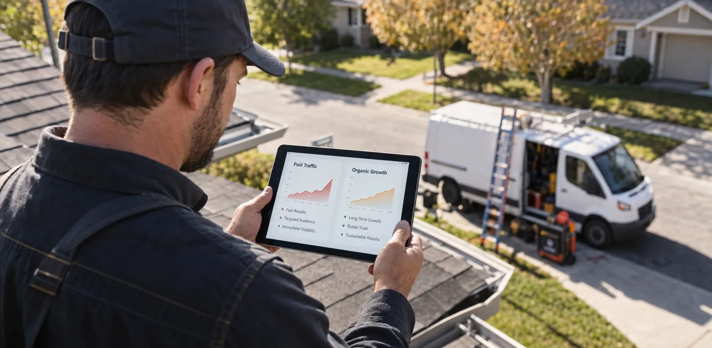



Mobile SEO means making sure your website is fast, accessible, easy to use on a phone, and fully crawlable by Google’s smartphone crawler. Under mobile-first indexing, Google primarily uses the mobile version of your pages for indexing and ranking – including the results desktop users see.
For home service companies, mobile performance is a business issue as much as an SEO one. BrightLocal’s 2026 consumer research found that 73% of recent local business searches began on a mobile device.
So when a homeowner types “emergency plumber near me” from a flooded basement, what does your site do – load and show a tap-to-call button, or stall for four seconds? Start with what mobile SEO actually covers.
What Is Mobile SEO?
Mobile SEO is the process of optimizing your website for searchers on phones while ensuring Google can crawl, render, and understand the same important content.
Google now primarily crawls websites with its smartphone Googlebot and uses the mobile version of a page for indexing and ranking. That means important service descriptions, headings, internal links, metadata, images, and structured data should remain available on mobile – not disappear behind a stripped-down version of the page.
For a plumbing, roofing, HVAC, or remodeling company, mobile SEO has two sides:
- Technical performance: Google needs to access and understand the page, and visitors need it to load quickly.
- Conversion usability: Homeowners need to read the page, navigate it, tap the phone number, and request service without encountering interface friction.
A slower mobile site is not automatically “invisible” to Google, but inaccessible content, poor performance, and a difficult mobile experience can all reduce the value of the page for searchers.
Why Mobile SEO Matters for Home Service Businesses
Think about how your leads actually find you. A homeowner hears water running behind a wall, grabs their phone, and types “emergency plumber near me.” They’re not at a desk comparing five websites. They tap the first result that loads, and if it stalls or the number is buried, they hit back and call your competitor.
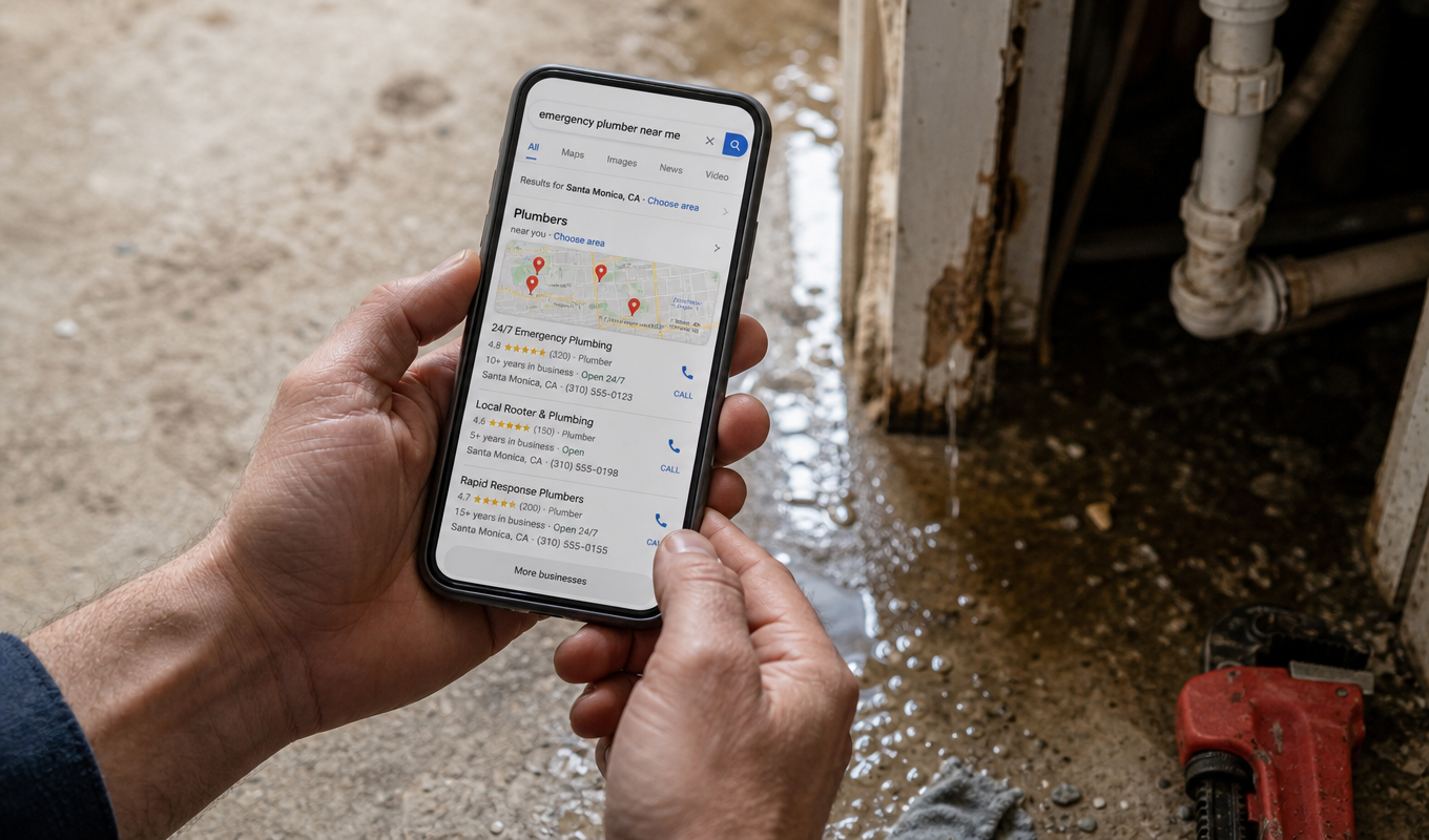
That makes the mobile experience part of the lead-generation process. If the page loads slowly, hides the phone number, uses tiny text, or forces someone through a difficult form, that visitor can leave before your sales process ever starts.
Mobile-First Indexing
Mobile-first indexing adds another reason to get the experience right. Google primarily evaluates the mobile version of your content, so important information that disappears or becomes inaccessible on mobile can also affect how Google understands the page.
This is why mobile SEO still matters alongside local SEO for an HVAC company. Google says local results are mainly based on relevance, distance, and prominence, while a fast, readable, mobile-friendly site helps turn that local visibility into calls and leads.
Getting this right starts with a basic technical decision: how your site actually serves mobile pages.
How to Configure Your Site for Mobile
There are three common ways to serve pages to mobile devices: responsive design, dynamic serving, and separate mobile URLs.
Responsive Design
Responsive design uses the same HTML at the same URL for every screen size, automatically resizing the layout. Google’s own guidance calls it the easiest configuration to implement and maintain. One page, one set of ranking signals, no duplicate versions to keep in sync.
Dynamic Serving & Separate URLs
Dynamic serving keeps the same URL but returns different HTML depending on the visitor’s device. It is still supported, but it creates more technical complexity and more opportunities for the mobile and desktop experiences to fall out of sync.
Separate mobile URLs use a second URL structure such as m.example.com. Google still supports this setup, but it requires additional redirects, canonical and alternate tags, structured-data management, and mobile/desktop content parity.
If you’re building or rebuilding a contractor website today, responsive design is usually the simpler option.
| Attribute | Responsive design | Dynamic serving | Separate mobile URLs |
|---|---|---|---|
| URL structure | One URL | One URL | Two URLs |
| Maintenance load | Lowest | Moderate | Highest |
| Google’s recommendation | Recommended for new sites | Supported | Supported |
| Best fit | Most home service sites | Specialized implementations | Existing legacy setups |
How to Test If Your Site Is Mobile-Friendly
Three quick checks you can run before spending another dollar on ads or blog content.
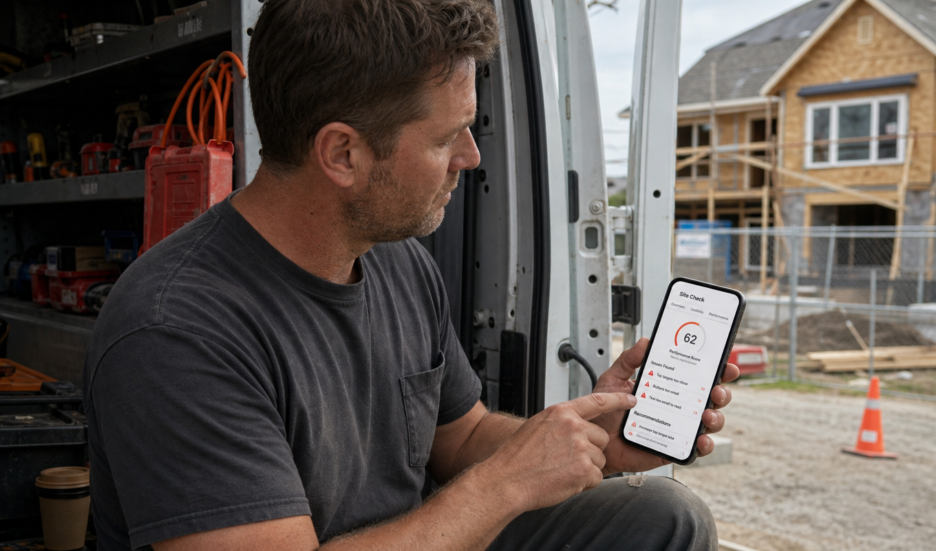
Start in Google Search Console with the Core Web Vitals report. Look for important service and location pages marked Poor or Need Improvement. Then use URL Inspection on individual pages to confirm Google can access and render the important content correctly.
Next, run PageSpeed Insights on your three highest-value service pages. Review real-user Core Web Vitals first when field data is available, then use the Lighthouse lab report to diagnose specific performance problems. On the 0-100 Lighthouse performance scale, 90+ is good, 50–89 needs improvement, and under 50 is poor.
Then pick up your own phone, on cellular data, not office Wi-Fi. Can you find and tap your phone number in under five seconds? That’s the real SEO mobile-friendly test, and no tool replaces it. These three checks are the starting point of any mobile SEO audit, and they’re where our technical SEO services begin too.
Want the full mobile-friendly SEO picture? Get a free estimate and start generating more leads for your construction business today.
These reports flag the problems – fixing mobile speed is usually where the biggest lead-generation gains hide.
Fix Core Web Vitals for Mobile Speed
Core Web Vitals are Google’s three metrics for measuring loading performance, responsiveness, and visual stability.
LCP, INP, CLS Explained
- LCP (Largest Contentful Paint) measures how long until the biggest visible element – usually your hero image – actually appears. Aim under 2.5 seconds.
- INP (Interaction to Next Paint) measures how fast the page responds when someone taps a button. Aim under 200 milliseconds.
- CLS (Cumulative Layout Shift) measures how much the layout shifts during loading. Aim under 0.1. Google grades all three on real Chrome user data at the 75th percentile, meaning three out of four visits need to pass.
Three fixes handle most of it. Google evaluates these metrics using real-user data at the 75th percentile.
Optimizing Images, Scripts, And Server Response
Three areas account for many of the problems we see on home service websites.
First, optimize images. A 4MB hero photo of a finished roof, served uncompressed, is usually the single biggest reason a page crawls on cellular. Serve appropriately sized modern formats, such as WebP or AVIF, and avoid sending desktop-sized assets to a phone unnecessarily.
Second, deferring non-critical JavaScript – chat widgets, review sliders, tracking scripts – so the page paints before the extras load. Third, fast hosting with a CDN, which shortens the trip for visitors across your service area.
Why does this outrank other SEO mobile optimization work? Because on a spotty signal in a driveway, a noticeable delay on a spotty signal ends the visit. Re-run PageSpeed Insights after each fix. Among mobile SEO best practices, speed pays back fastest – and it’s where your mobile SEO gains compound.
Speed gets people to the page. What happens once they land there determines whether they call.
Make Navigation & Content Thumb-friendly
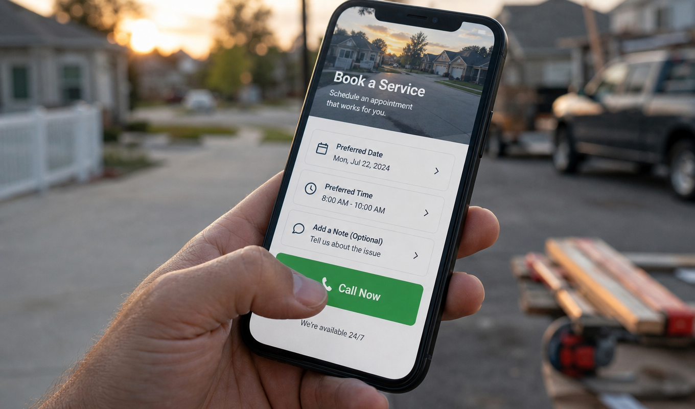
Picture a homeowner standing in a driveway, one hand holding a phone, the other holding a flashlight. That’s your actual user. Design for that hand.
Tap-target Sizing & Viewport Setup
Start with tap-target sizing. Lighthouse uses roughly 48 by 48 CSS pixels as a useful benchmark for tappable controls, with enough space between nearby targets to reduce accidental taps.
Make sure important buttons are large enough to hit comfortably:
- Call
- Request Estimate
- Schedule Service
- Get Directions
- Open Menu
Next, confirm your viewport meta tag is set:
<meta name=”viewport” content=”width=device-width, initial-scale=1″>
Without it, mobile browsers can render a desktop-width layout and shrink everything down. Be equally careful with pop-ups. A full-screen newsletter or promotion that covers the phone number or quote button can hurt conversions, even if the underlying page ranks well.
The highest-value fix? A sticky click-to-call banner pinned to the bottom of every service page. An HVAC company running one keeps “Call now” reachable whether the visitor is at the top of the page or halfway down a FAQ.
Among mobile SEO best practices, a thumb-friendly layout is the cheapest win you’ll get. However, Good navigation only helps if the content behind it matches what desktop visitors and Google’s index actually see.
Keep Mobile & Desktop Content in Parity
Parity means mobile pages carry desktop’s substance: content, headings, internal links, metadata. Not identical looks – whatever Google’s smartphone crawler reads and renders. Contractors trip here. A remodeler cuts its mobile service page down to a photo, a paragraph, and a call button, leaving permits, timelines, and pricing desktop-only. Google indexes mobile; that content vanishes.
Accordions and tabs are fine. Collapsed text gets indexed. Content stripped, or injected after a tap, doesn’t.
Then mobile site SEO’s least glamorous piece: schema. LocalBusiness and Service markup should remain available on mobile when you use it. If structured data appears on desktop but is missing from mobile, Google may receive incomplete information from the version it primarily indexes.
Title tags and meta descriptions truncate earlier on mobile – front-load service and city near the very beginning of the title and description.
How do you verify? Search Console’s URL Inspection tool shows rendered HTML – compare it against desktop. That’s your SEO mobile site check. Missing headings, links, or schema can cap mobile SEO rankings.
Mobile SEO Best Practices Checklist for 2026
Hand this list to whoever manages your site.
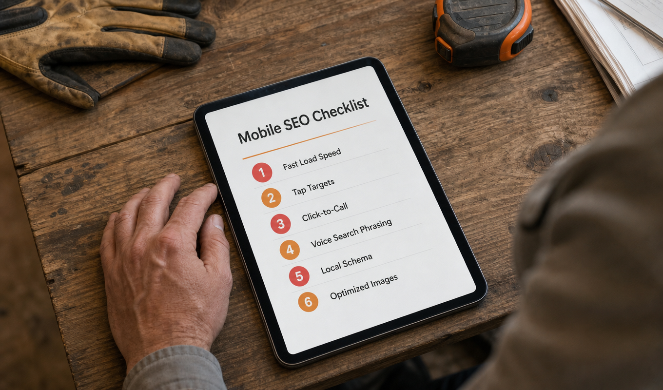
- Check Core Web Vitals
Prioritize LCP, INP, and CLS on service pages that generate leads. - Optimize images
Resize oversized images and serve modern formats such as WebP or AVIF. - Make important controls easy to tap
Give call buttons, menus, forms, and other interactive elements enough size and spacing for one-handed use. - Test forms and conversion paths on a real phone
Keep quote forms concise, use appropriate keyboard input types, show useful validation messages, and make errors easy to correct. - Keep mobile content and structured data complete
Do not remove important service information, internal links, headings, or schema markup to shorten the mobile version. - Make calling or requesting service obvious
A visitor should not have to hunt for your phone number or primary CTA.
Review these items after redesigns, CMS changes, major plugin updates, and new template launches.
Common Mobile SEO Mistakes to Avoid
Four problems recur on mobile service sites. The mix varies by site, but the list rarely does.
Unoptimized or oversized images lead the list. A roofing gallery serving 12 full-resolution job photos at desktop dimensions stalls on mobile devices every time. Compress, convert to WebP, and set correct display dimensions.
Blocked CSS/JS resources come next, and they’re sneakier. When robots.txt blocks stylesheets or scripts, Googlebot can’t render your page properly – it sees a broken layout and judges accordingly. Use Search Console’s URL Inspection tool and test the live URL. Check the rendered page to make sure important CSS, JavaScript, images, and content are accessible to Googlebot.
A missing viewport meta tag is the cheapest fix on this list. Without it, the browser renders your desktop layout and shrinks it, so text goes tiny, and buttons stop being tappable. One line of HTML makes the page SEO-friendly and mobile-friendly again.
Last, duplicate m-dot content. Still running m.yoursite.com alongside the main domain? You’re splitting backlinks and authority across two near-identical URL sets, and mobile pages often ship with thinner content and missing schema. Consolidate to one responsive domain.
Any mobile SEO audit worth paying for flags these first, because they cap Google SEO mobile rankings and calls simultaneously – the foundation of SEO for mobile sites.
Once these are fixed, the work shifts from one-time repairs to ongoing monitoring.
Track Rankings & Get a Free Mobile SEO Audit
Your desktop rankings can hold steady while your mobile rankings slide. Same keyword, different result – and mobile is where the calls come from.
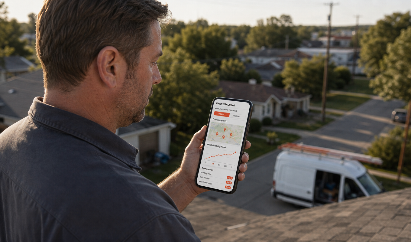
So track mobile separately. Rank tracking tools simulate real mobile searches from specific locations using geo-coordinates, which matters when your service area covers six suburbs and you rank first in one of them. Search Console gives you an average position over time – it won’t tell you that an electrician’s “panel upgrade” page sits at #3 in one city and #14 in the next.
Set up mobile-specific views for your top ten money keywords and check monthly. When you track your mobile keyword rankings alongside call volume, you can see which fixes actually produced booked jobs.
That’s how ongoing mobile SEO optimization becomes a repeatable strategy rather than a one-time cleanup. A mobile SEO audit sets the baseline, while monthly tracking tells you whether it’s holding.
Not sure where your site stands? Claim your free mobile SEO audit – the same technical review behind 100+ delivered projects and a 98% average client NPS, per our 2026 data.
Here’s what actually shows up when we run these audits on real home service sites.
Final Words on Mobile SEO
Mobile SEO is not a separate layer you add on top of your overall SEO strategy. Google primarily crawls and indexes the mobile version of your content, while your customers increasingly use phones to find, evaluate, and contact local businesses.
Start with the pages that drive revenue. Run your highest-value service pages through PageSpeed Insights. Review Core Web Vitals in Search Console. Inspect important URLs to make sure Google can render the content correctly. Then test the same pages yourself on a real phone using cellular data.
Then keep score. Track mobile rankings monthly against call volume so you know which fix produced which booked job. More practical breakdowns like this one live on our blog.
Want to see what this work looks like on real roofing, HVAC, and plumbing sites? Browse our case studies.
Ready to stop losing calls to a slow phone experience? Reach out to our team – get a free estimate and start generating more leads for your construction business today.
FAQ
01 What are the 4 types of SEO?
Technical SEO (crawlability, speed, mobile-friendliness), on-page SEO (content, titles, keywords), off-page SEO (backlinks and authority), and local SEO (Google Business Profile, near-me visibility). Mobile work touches all four, especially technical and local.
02 Is mobile-first indexing the same as mobile SEO?
No. Mobile-first indexing describes how Google crawls and indexes your website: Google primarily uses the mobile version of your content. Mobile SEO is broader. It includes mobile crawlability, responsive design, Core Web Vitals, content parity, navigation, forms, and the overall experience of finding and contacting a business from a phone.
03 Why is mobile SEO different from traditional SEO?
Google ranks the mobile version of your site, not the desktop version. Mobile adds usability factors desktop ignores – tap targets, viewport, pop-up restrictions. Mobile SERPs also truncate titles and descriptions earlier, so front-load your service and city.
04 What does a mobile SEO audit check?
Mobile usability issues (tap targets, viewport, text size) in Search Console, Core Web Vitals scores in PageSpeed Insights, and blocked CSS or JavaScript files. It also compares mobile and desktop content for parity – headings, links, and schema.
05 How can home service businesses check if their site is mobile-friendly?
Review Core Web Vitals in Google Search Console, run your homepage and top service pages through PageSpeed Insights, and use URL Inspection for important pages. Finish by testing forms, tap targets, and click-to-call buttons on your own phone using cellular data.
06 How often should you review your mobile SEO?
Check after every redesign, CMS update, or new page launch. A quarterly review of Core Web Vitals and mobile usability catches drift before it costs you calls. Track mobile rankings monthly – they move independently of desktop.
Love what you’re reading? Sign up for our newsletter to get our newest articles, helpful tips, and fresh marketing updates delivered right to you. No spam, just the good stuff.